|
In 1940, Sears introduced the Harmony House brand as an
interior-decorating scheme that used four basic colors that
could be coordinated with each other. (The year before, Sears
catalogs featured "Charm House," a similar program.)
Customers were encouraged to use a color wheel that was supplied
in the catalog for coordinating colors.
Harmonizing colors had long been a problem for the company.
For example, rose-colored draperies made by one source might
clash with a rose rug produced by another manufacturer. Each
factory used its own colors, and the clashes that resulted were
impeding the company's sales of home furnishings.
In response to customer demand, Sears eventually expanded
Harmony House's palette to include 18 colors that they
considered to be the most attractive to customers. Each color
came in light, medium, and dark shades.
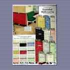
Harmony House colors were: Tuscan Rose and Wine, Valley Rose,
Federal Gold, Cherry Pink and Red, Jubilee Peach, Spice Beige
and Brown, Colonial Blue, Sage Green, Aquamarine, Chartreuse,
Dawn Gray, Mint Green, Pacific Blue, Sunshine Yellow, Parchment
Ivory, Beige, and Brown, Victorian Pink, Rose, Red and Wine, and
Malibu Peach, Coral and Rust.
The Harmony House style and color system was not merely limited
to carpets and paints, either; the entire house could be
furnished according to the colors. Almost any household item
could be bought to fit the Harmony House schemes, including:
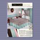
covered upholstery fabrics, draperies, slipcovers, desks,
bookcases, bedroom furniture, sheets, towels, table lamps, wall
paints, clothes hampers, canister sets, boudoir lamps, shower
curtains, garment bags, chenille spreads, dinnerware, wallpaper,
lounge chairs, dinette sets, living room sets, mirrors,
carpeting, tile, and appliances.
|


